ANATOMY OF A TYPE
CARD DESIGN
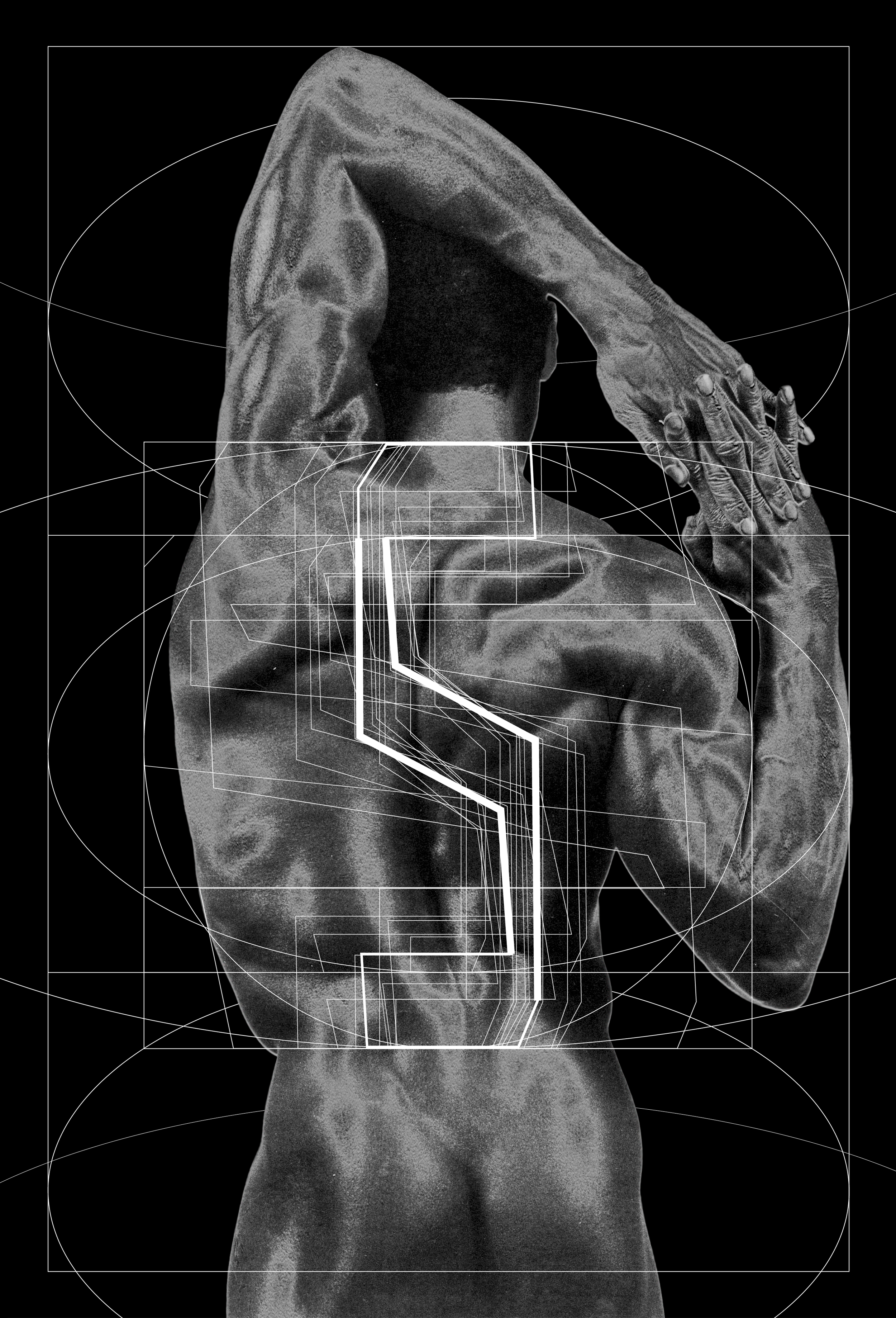
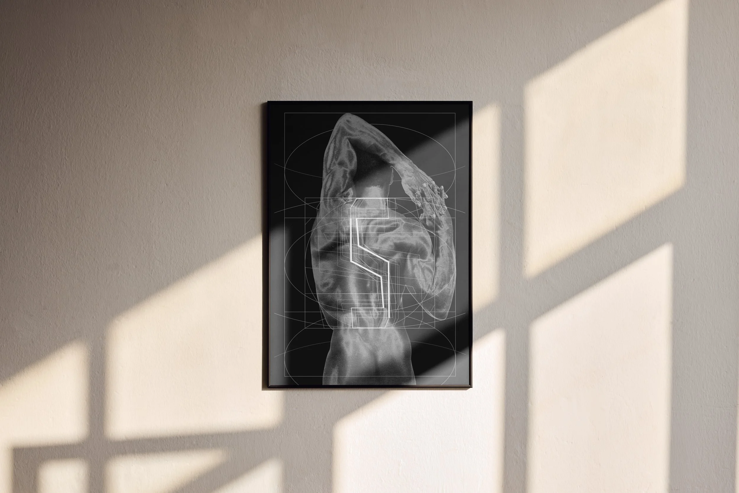
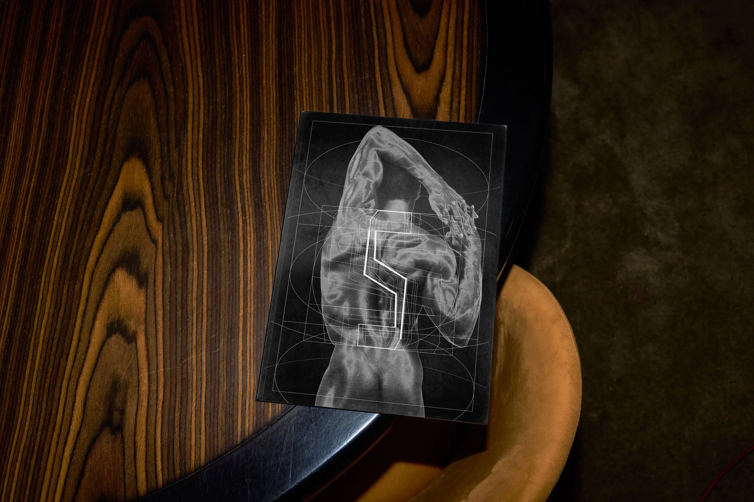
The variable nature of the typeface was central to the concept — working exclusively with the letter "S," I was drawn to how Presto captures multiple distinct variations of a single letterform, making it the ideal vehicle for demonstrating the anatomy term itself.
To bring a human dimension to the design, I looked to the photography of Robert Mapplethorpe — whose body of work is defined by a striking tension between sensuality and formalism. His images of the human figure carry an almost sculptural quality: fluid and organic in subject, yet composed with rigid, architectural precision. That duality felt like a natural dialogue with type — soft, elaborate figural imagery set against the stiff, geometric exactness of letterforms. Together, they reinforced the concept of the spine: something at once structural and deeply human.
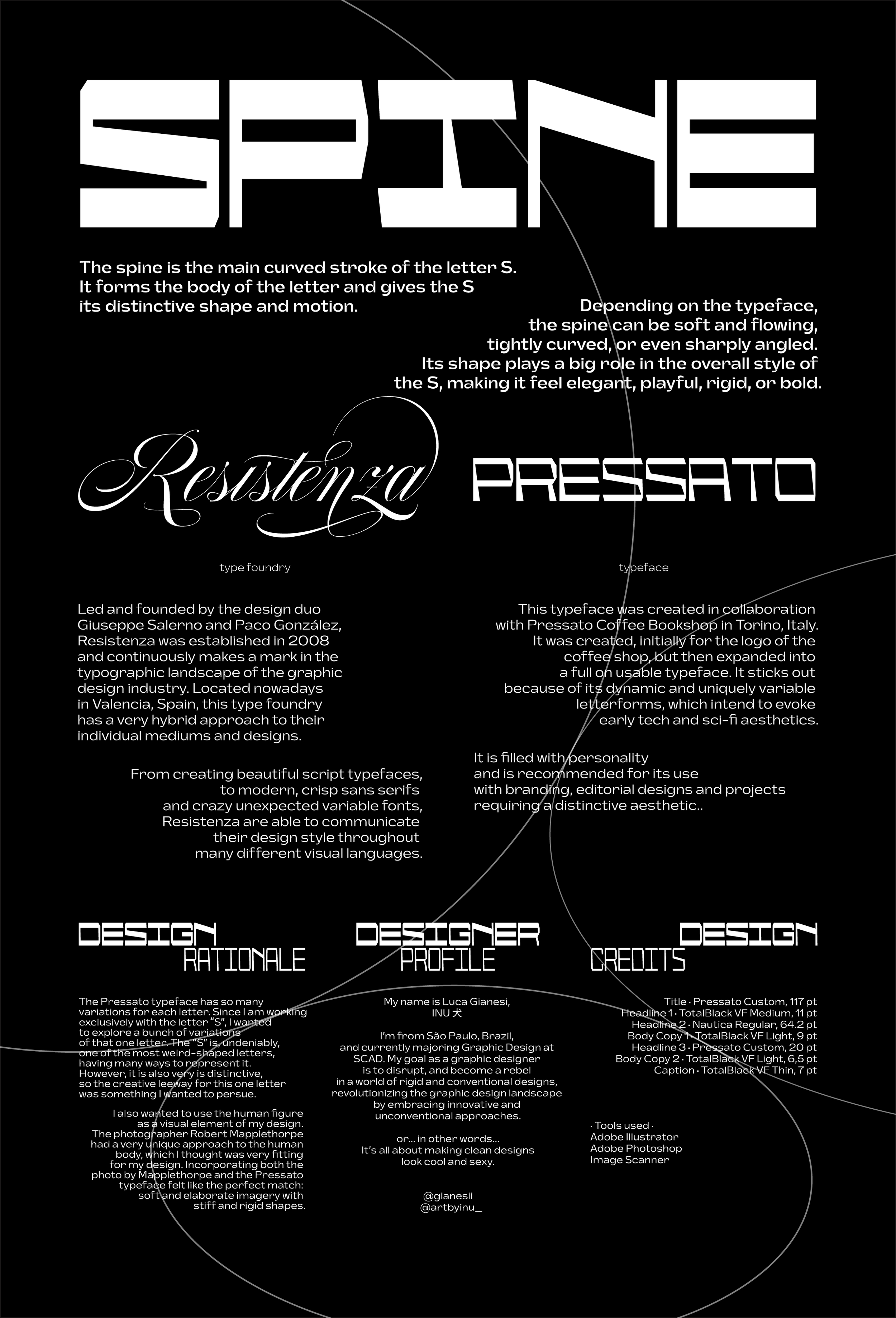
A two-sided type anatomy card exploring the term spine, designed using Presto Variable by the Italian type foundry Resistenza.
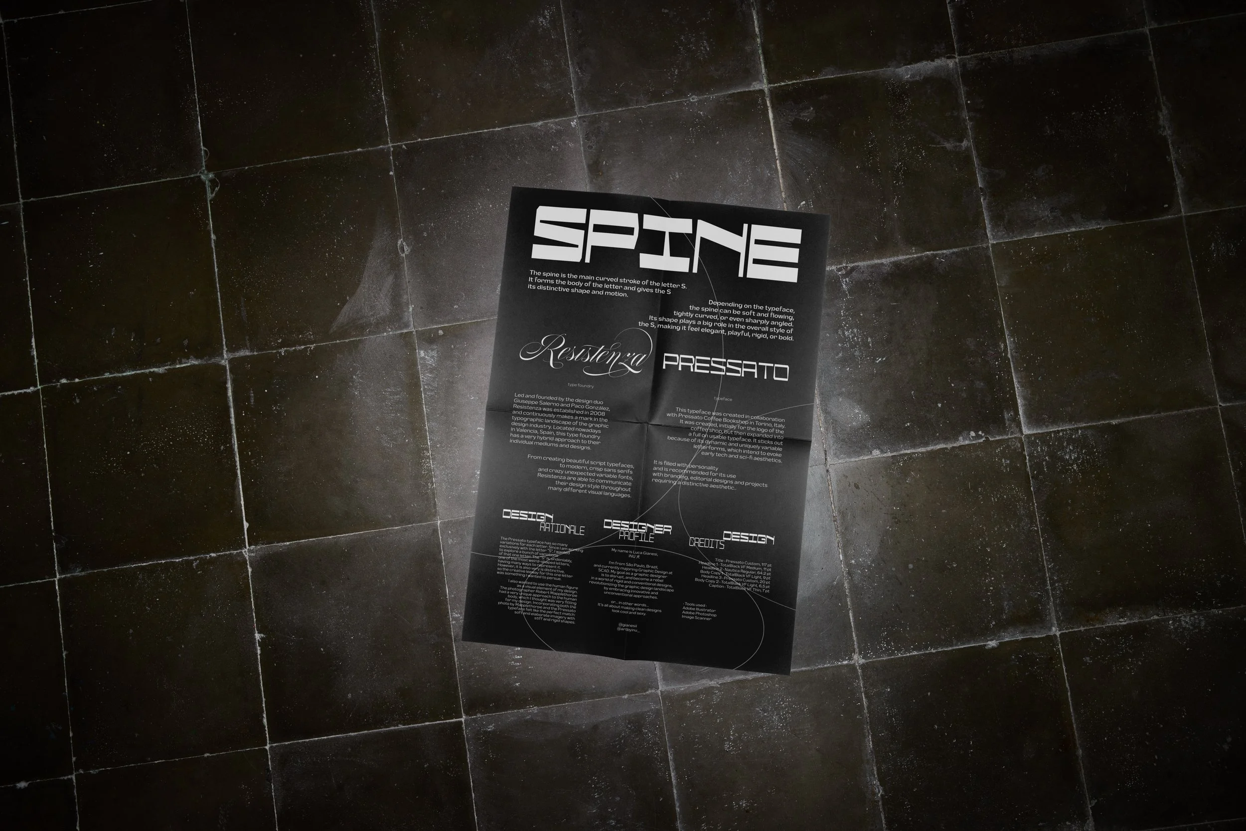
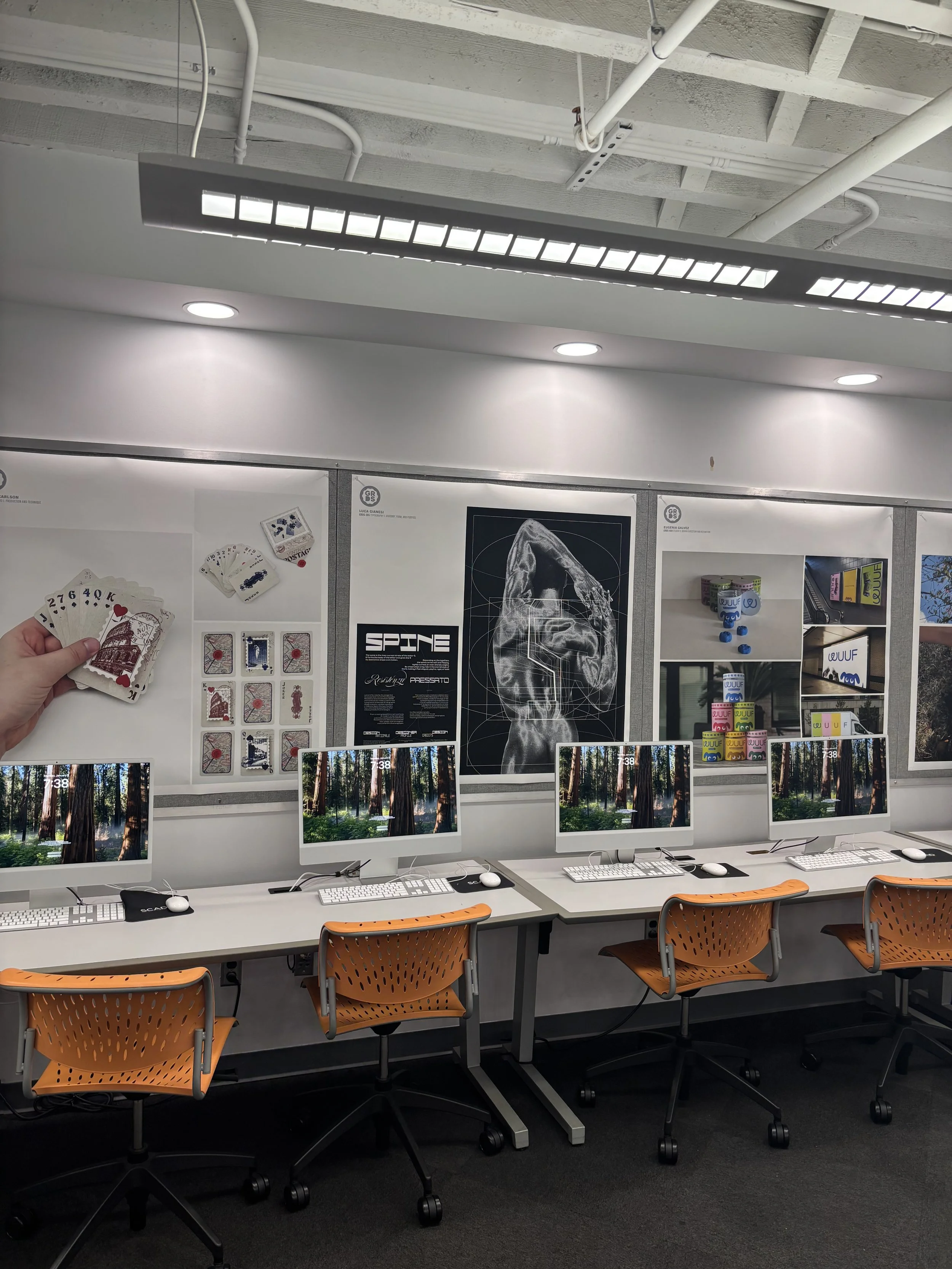
Project hung up on SCAD Graphic Design Department