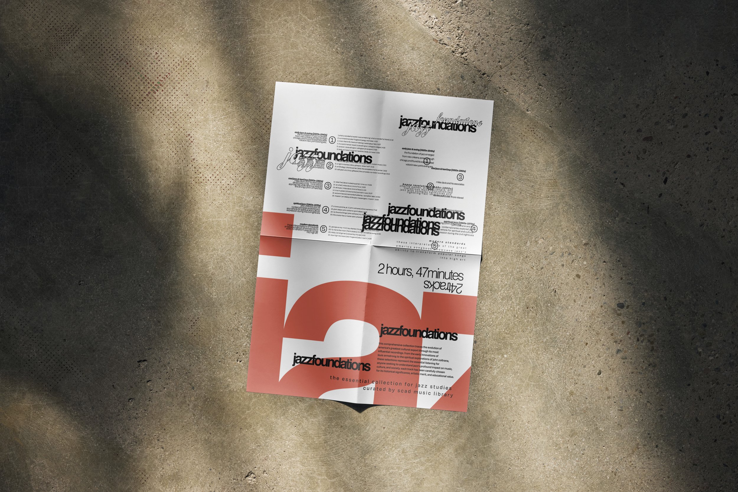
JAZZ
FOUNDATIONS
Typographic poster
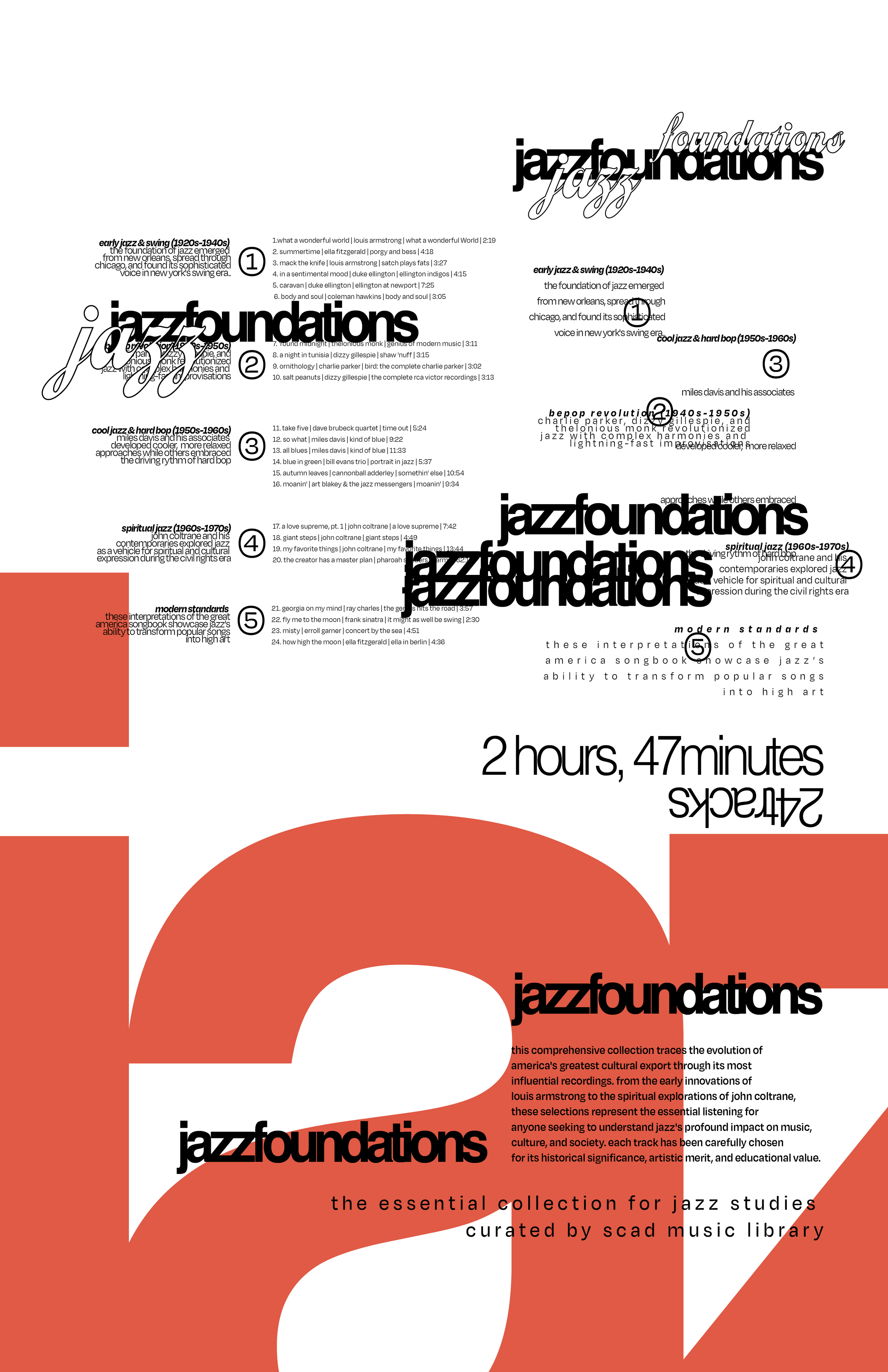
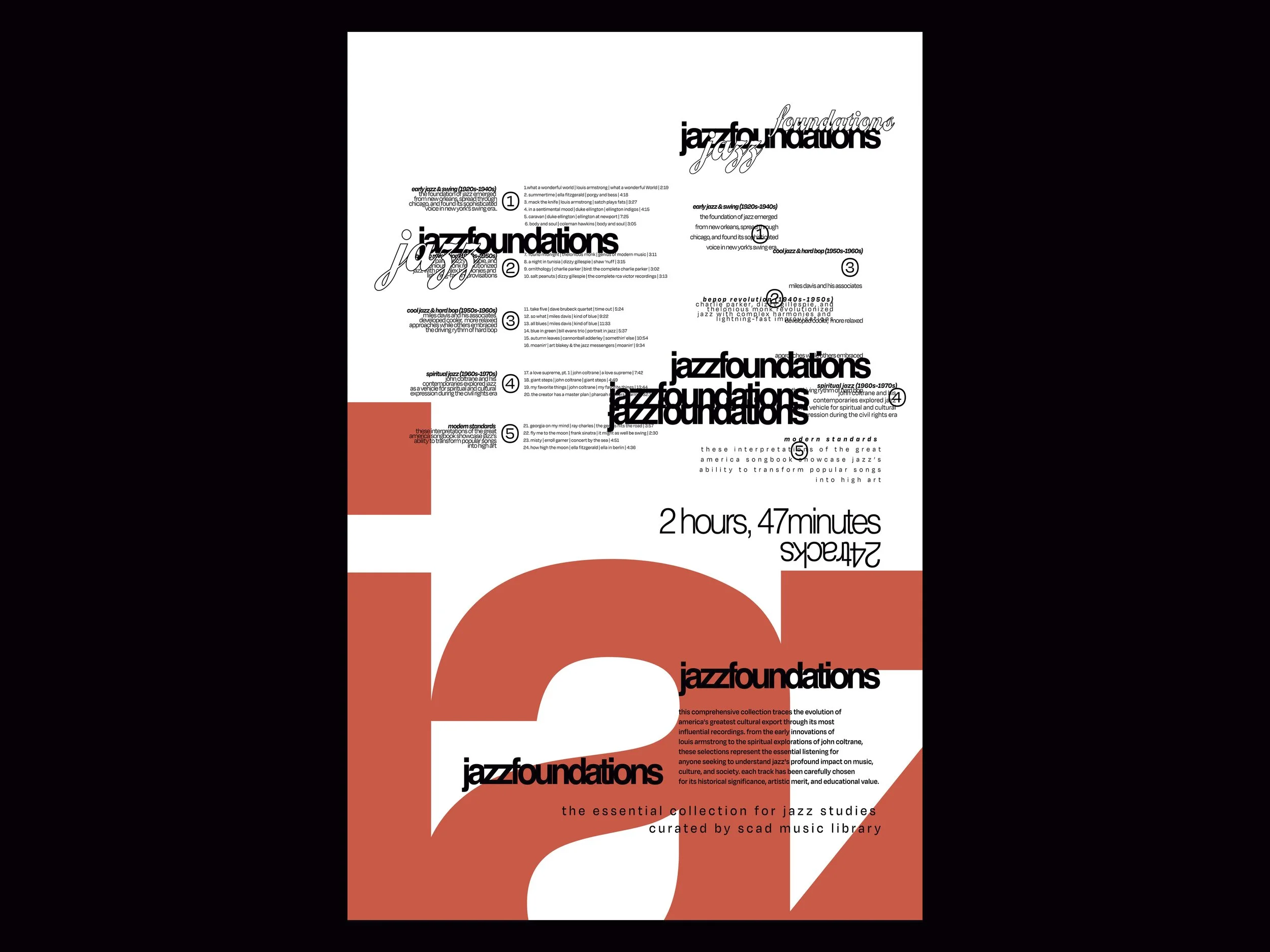
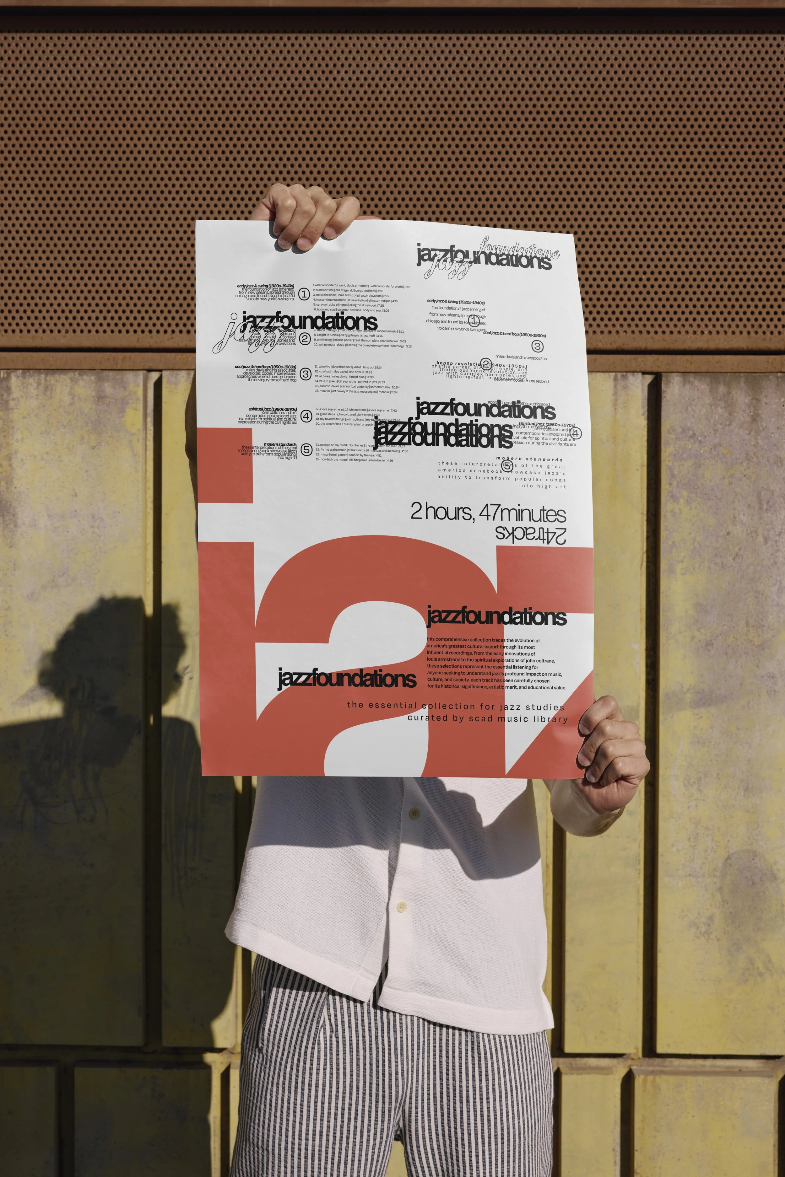
Working exclusively with type, I used extreme shifts in scale to build texture and contrast, while treating negative space as an active compositional element rather than an afterthought.The central concept was jazz itself — the idea of organized chaos: music that feels spontaneous and free yet is rooted in deep structural knowledge. To express that tension visually, I leaned into the assignment's grid system as a framework for controlled disorder — using it to choreograph overlapping text, unconventional paragraph settings, and deliberate compositional breaks that feel improvisational on the surface, but are structurally intentional underneath.
A grid-based typographic poster designed for a fictional jazz playlist, curated on behalf of the university's music library.
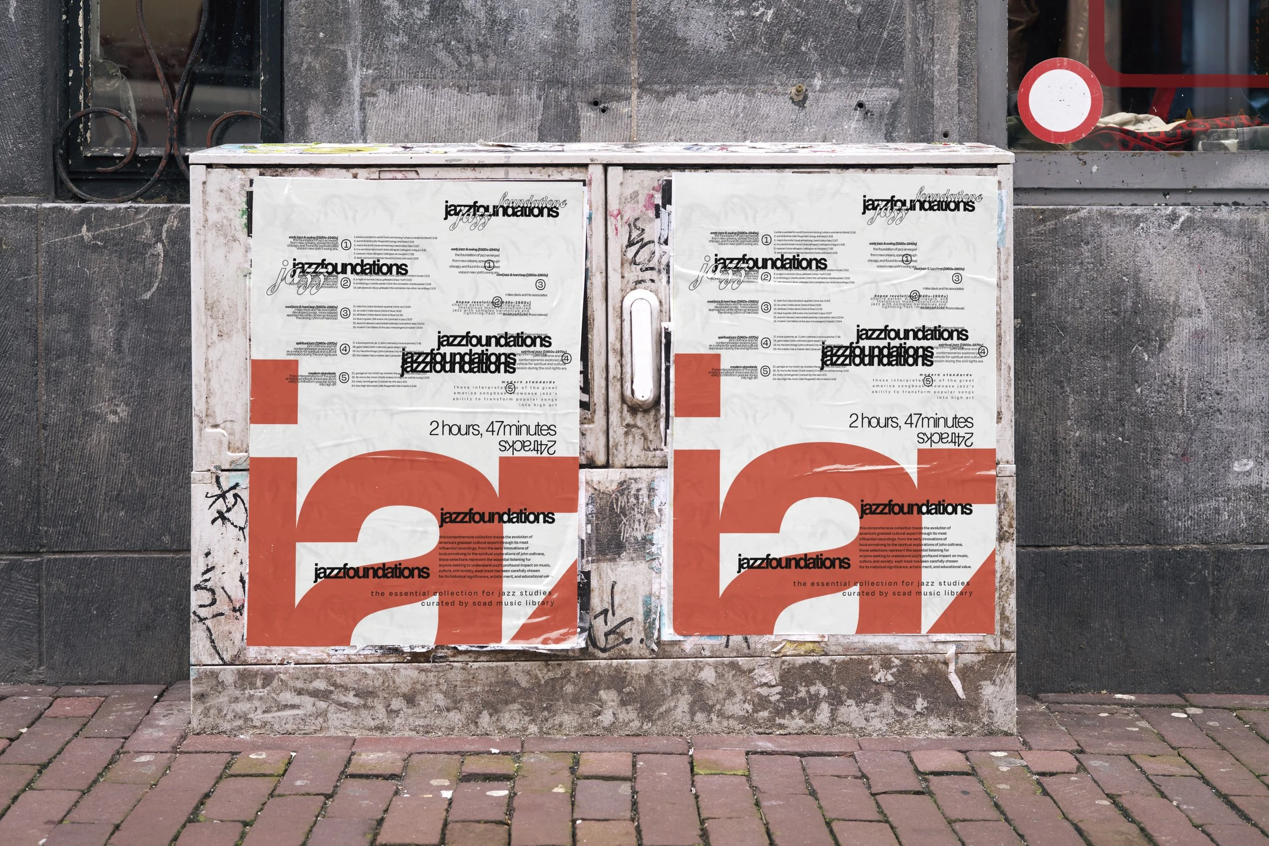
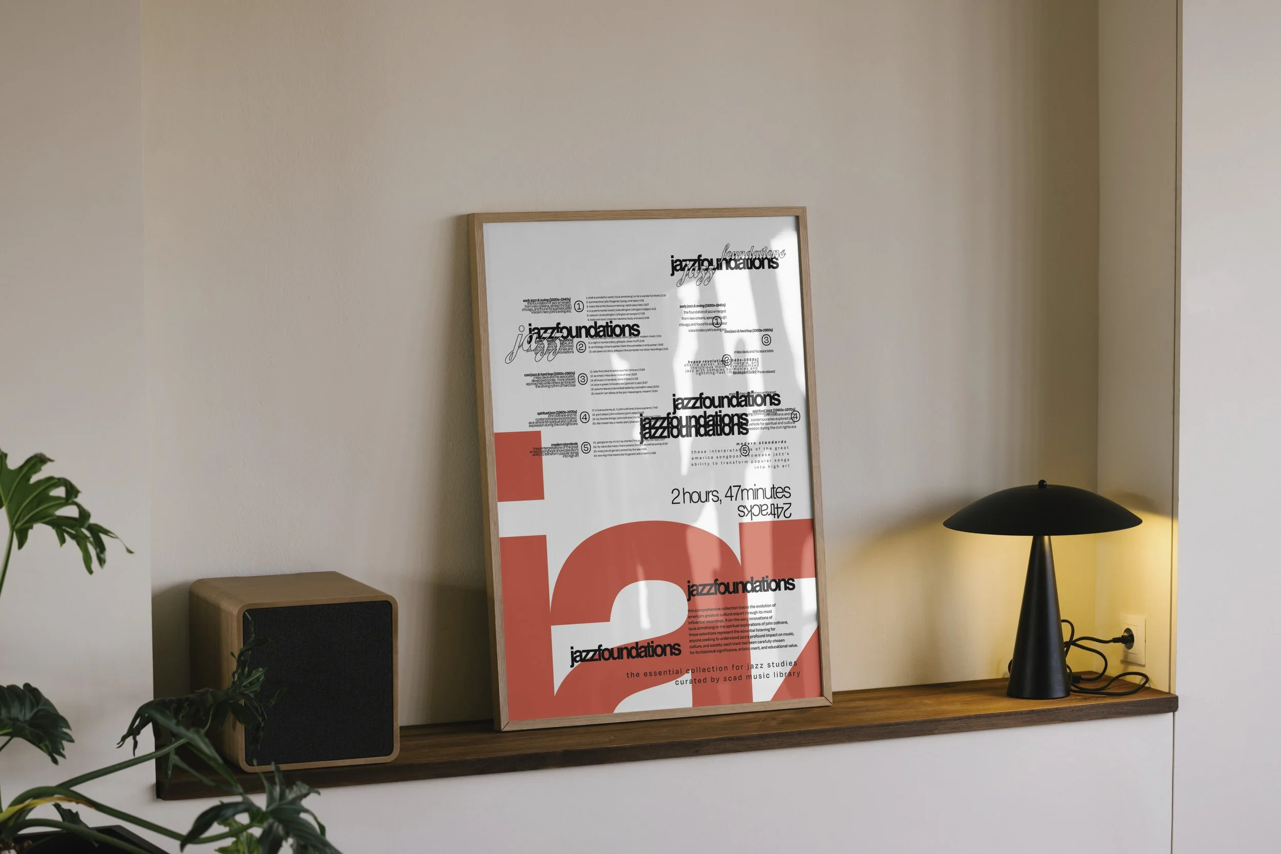
Project hung up on SCAD Graphic Design department
Highlighted in the Winter 2026 Newspaper in the SCAD Graphic Design