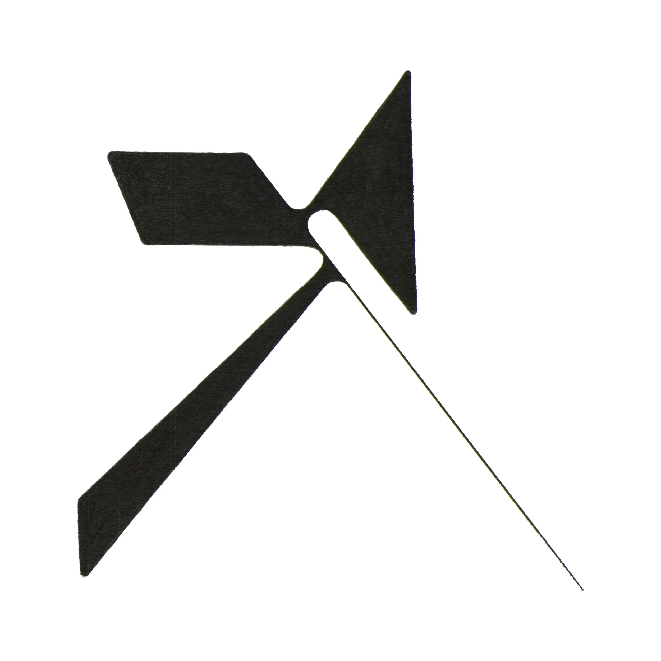
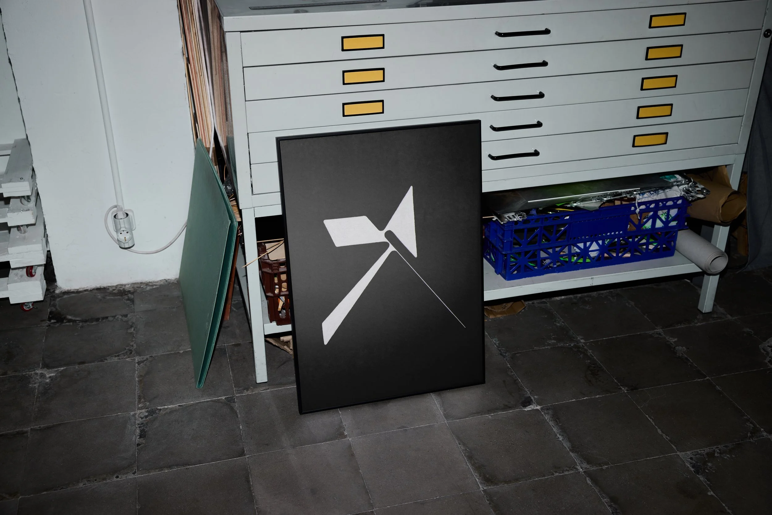
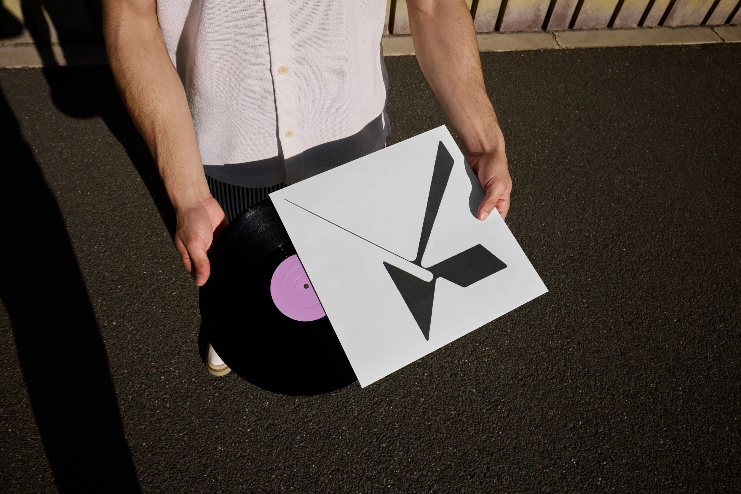
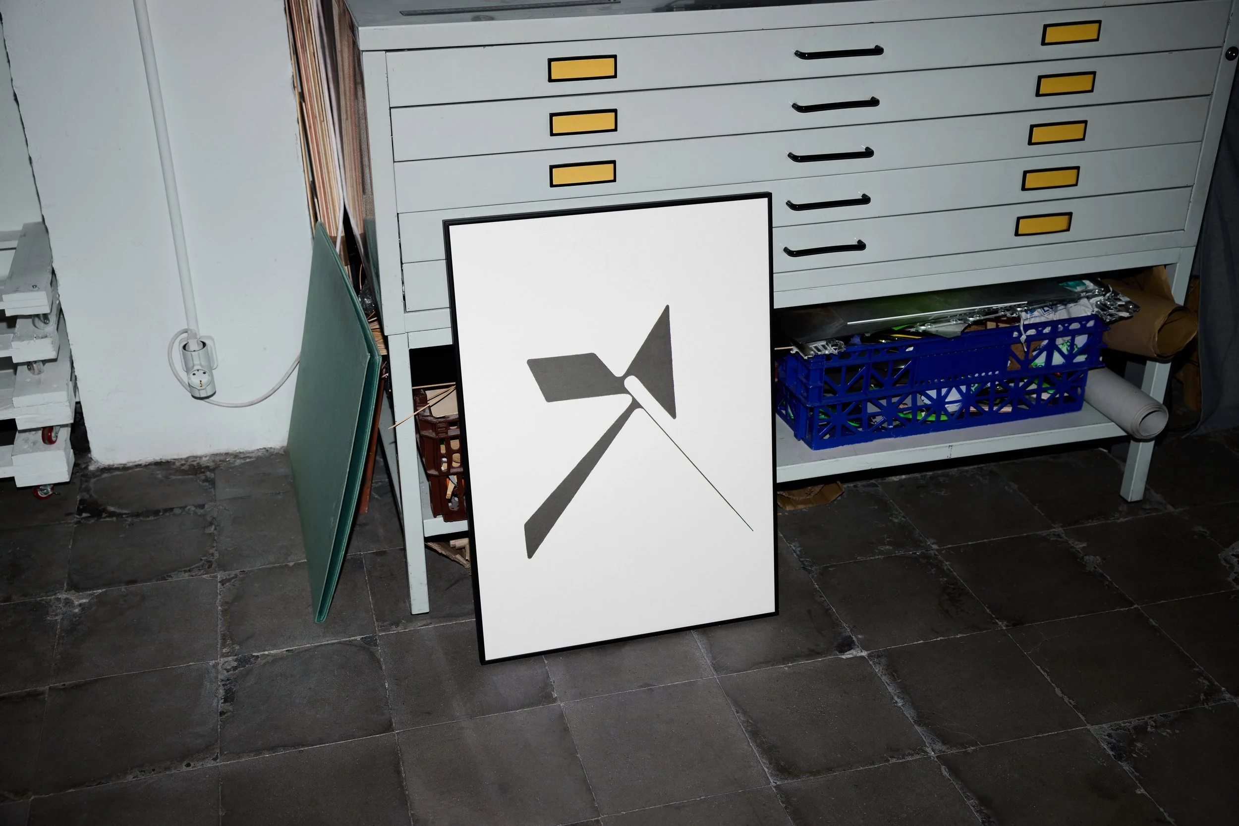
Assigned the letter X, I approached the brief not just as a typographic exercise but as an exploration of the letter as a symbol — one that carries meaning far beyond the alphabet. The final letterform was designed with that symbolic weight in mind, and extended into a series of mock applications across physical media: a tattoo, an album cover, and a poster. Each context was chosen to reflect the versatility and cultural resonance of the mark — demonstrating how a single, well-considered letterform can function as a cohesive visual identity across vastly different surfaces and audiences.
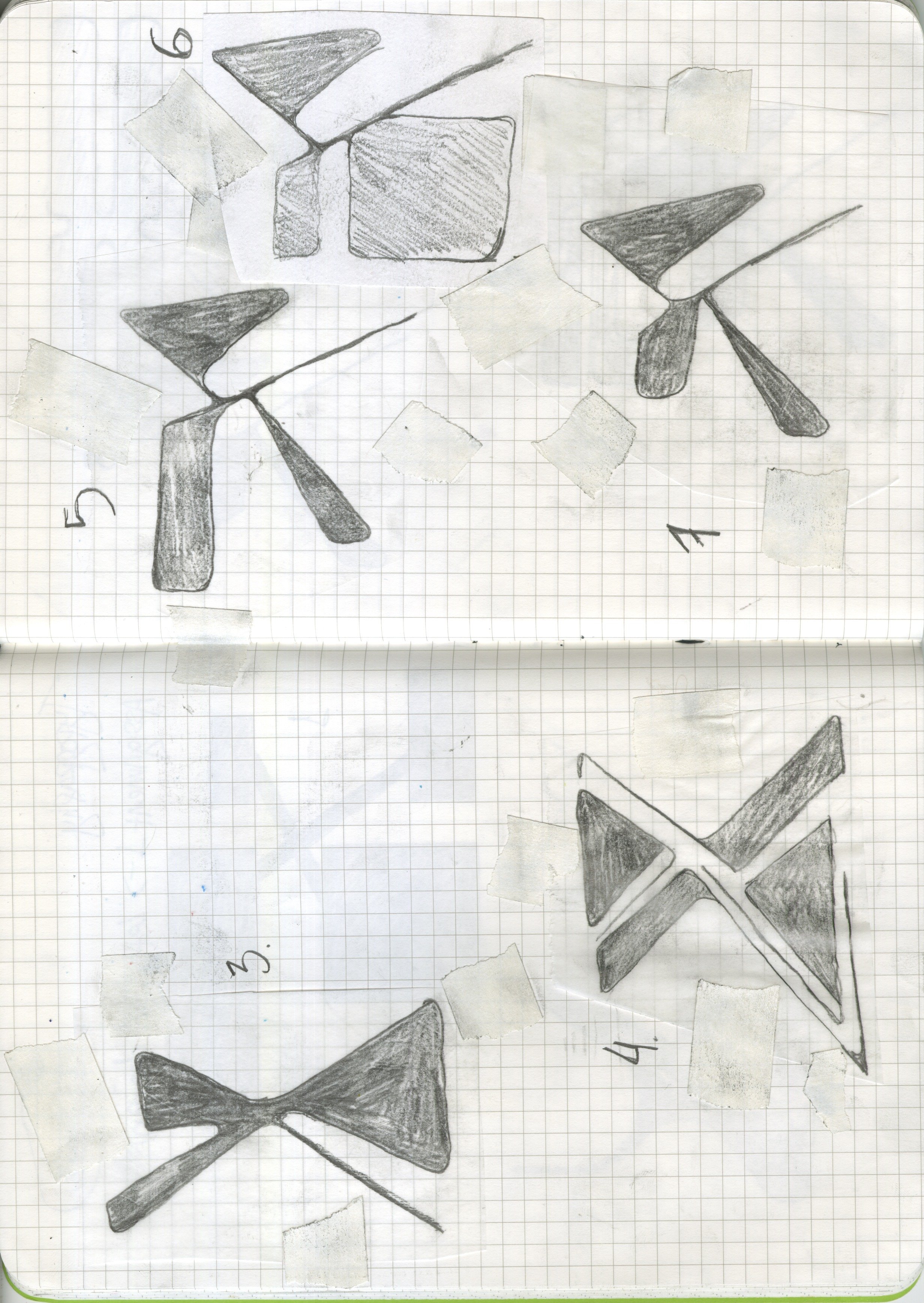
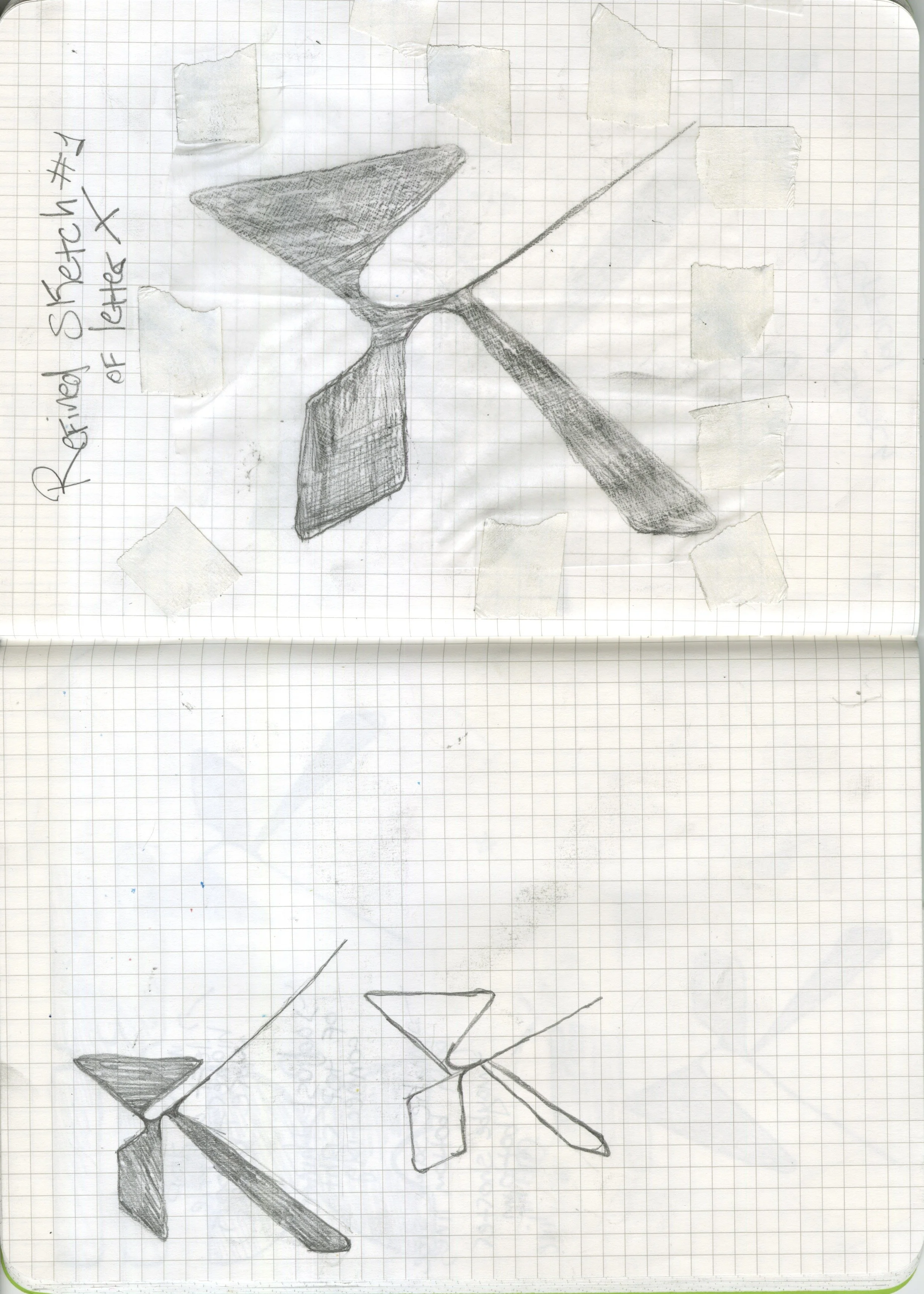
A hand-drawn letterform study in graphite, developed through iterative refinement from initial sketch to final execution.
Letter X
letter design